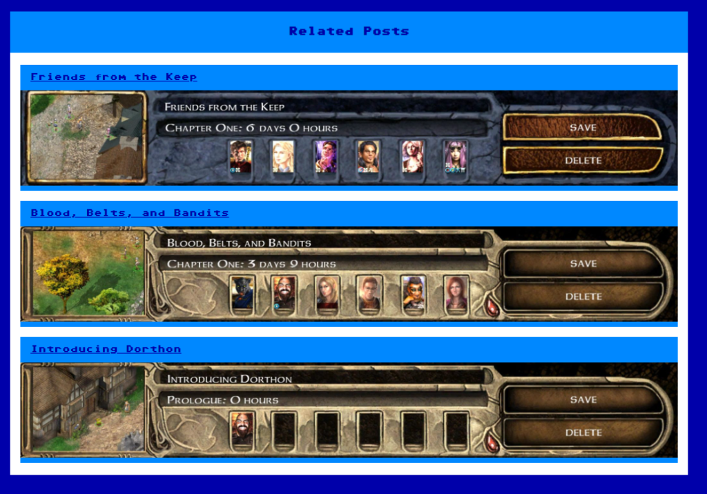
In a previous post I showed how I developed the “related posts” feature on this site, as well as the CSS I used to make it look nice. At the end of the article I noted a problem with the way the images looked, namely that there was a blue border at the bottom of the image despite there being no padding or margin. I managed to fix this problem, or so I thought…
The Problem
Here is the problem I was trying to fix. I didn’t want the light blue border at the bottom of these images. Changing the padding and margins of the image and the <div> elements around it solved nothing.

The “Fix”
I “fixed” this by setting the height of the surrounding<div> element to be the same as the image. This worked. Kind of.
.related-posts img
{
	height:150px;
}

.related-posts .post-thumbnail
{
	height:150px;
}
It turns out this still led to some issues. Some images didn’t stretch all the way across the page, leaving an ugly looking partial border on the right. I tried to fix this by setting the width of the image to 100%. And it worked. Kind of.
Now the images would often have the wrong proportions. Depending on the resolution of the browser and the size of the image, they would often appear stretched and/or squashed. There had to be a better way.
The Solution
As it turns out, there is a better way. Instead of manually setting the height, we can just set the image to display as a block. By also setting the width to 100%, we will get a perfectly sized image with no unwanted borders every time.
.related-posts img
{
	display:block;
	width:100%;
}
<img> elements have default display of inline, which makes it behave like a <span> element. By setting it to <block> we switch its rendering behaviour to be similar to a <p> element, and the padding and margin works as we expect. In other words, if we say no borders, there are no borders.
The added advantage here is that we are using a relative size (100% width), meaning the images will automatically scale and will never appear stretched or squashed even on the smallest of browsers.
The lesson here is that even after 15+ years of programming, you won’t know everything. Sometimes you still need to learn the simplest of techniques.


