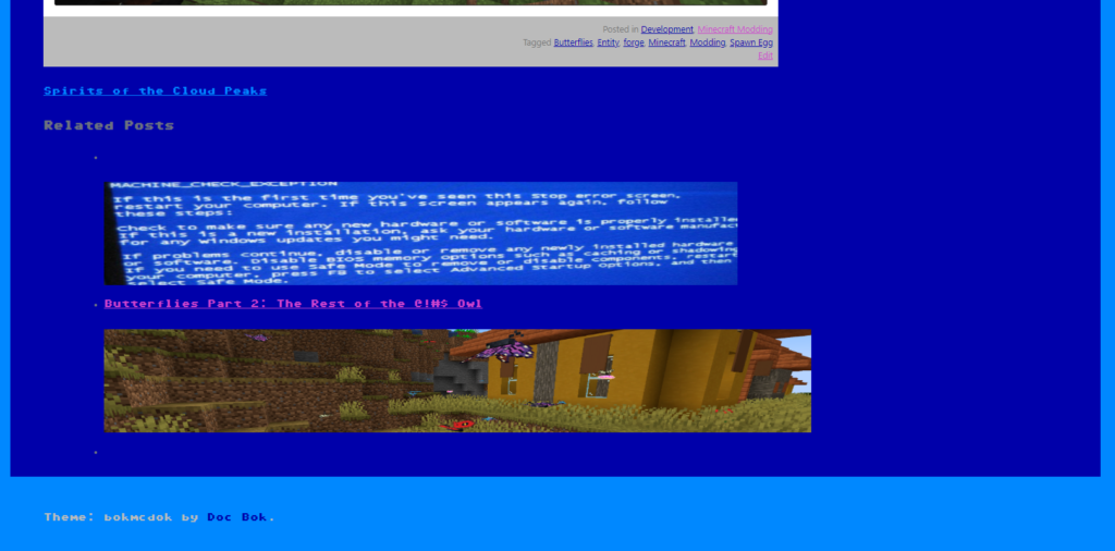
If you’ve made it to the end of any of my recent posts, you’ll notice the addition of some related posts for you to explore. I’ve been wanting to incorporate this feature into my blog for a while now, and a couple of weeks ago, I finally took the time to do it.
One requirement I had was to avoid using a plugin. I wanted to be able to add custom code to my theme and have full control over its behavior.
Like any of my programming tasks, it began with a Google search. Initially, I could only find overly complex code snippets that broke the site. After some digging, I found a helpful answer on Stack Exchange. While it didn’t provide exactly what I needed, it was simple and easy to understand, making it a breeze to modify it to fit my exact requirements.
I also added the featured image to the link so they would look nicer when they are finished. I used my custom bokmcdok_post_thumbnail() function to achieve this, so it matches what we have on the blogroll.
I also set the number of posts to 3, 5 felt a bit excessive to me. Finally, I set the query to use a random order (using 'orderby' => 'rand') so that there would be variety in the posts.
After messing with the HTML a bit I came up with the following snippet:
			<div class="related-posts">
				<h3>Related Posts</h3>
				<ul>
			<?php
			//	Show related posts
			$related = get_posts( array( 'category__in' => wp_get_post_categories($post->ID), 'orderby' => 'rand', 'numberposts' => 3, 'post__not_in' => array($post->ID) ) );
			if( $related ) foreach( $related as $post ) {
			setup_postdata($post); ?>
					 <li>
						 <a href="<?php the_permalink() ?>" rel="bookmark" title="<?php the_title(); ?>">
							 <p><?php the_title(); ?></p>
						 	<?php bokmcdok_post_thumbnail(); ?>
						 </a>
					 </li>
			<?php }
			wp_reset_postdata();
			?>
				</ul>
			</div>
I pasted this into my single.php file after the navigation links and now articles with a similar category are displayed at the bottom of each blog post! Unfortunately, the result is kinda ugly…

To clean this up, we need a touch of CSS. It took some trial and error, but I eventually arrived at the following code:
.related-posts
{
	background:white;
	margin:0 3em 3em 0;
	padding-bottom:0.2em;
}

.related-posts h3
{
	background:#08f;
	color:#00a;
	padding:1em;
	text-align:center;
}

.related-posts ul
{
	list-style:none;
	margin:0;
	padding:0;
}

.related-posts li
{
	background:#08f;
	color:#00a;
	margin:1em;
}

.related-posts img
{
	height:150px;
}

.related-posts a, related-posts a:hover, related-posts a:visited
{
	color:#00a;
}

.related-posts p
{
        color: #00a;
        padding-top: 0.5em;
        margin: 0.5em 1em;
}
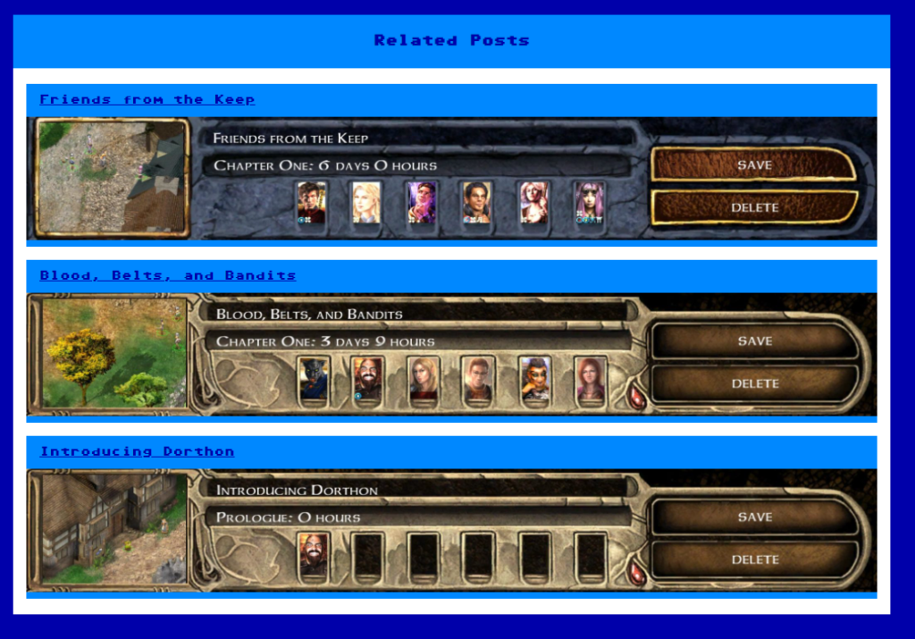
Most of the above is simple enough to figure out and understand, and it led to something that was almost perfect.

See how the light blue background is sticking out of the bottom of the images? I didn’t want that as it’s inconsistent with the rest of the website. I couldn’t figure out which element was causing it.
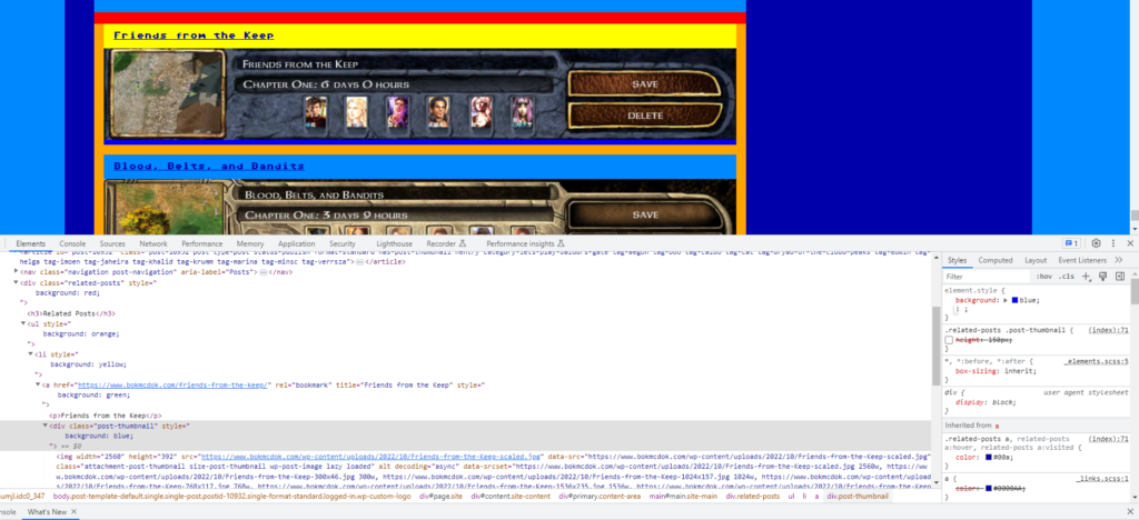
I needed to visualise what was happening, so I used the F12 Developer Tools to modify the background colours of all the elements from the outer div to the image itself.

Now I could see the dark blue element poking out of the image. It was the .post-thumbnail div that was responsible. But how to fix it? It turns out just setting it to the same height as the image works:
.related-posts img
{
	height:150px;
}

.related-posts .post-thumbnail
{
	height:150px;
}
Now it looks how I want it to, and you can check out the related posts below!


One thought on “Blog Posts May Be Related”